Core Reading
- Feigenbaum, A. and Alamalhodaei, A. 2020. Visual Data Storytelling. IN: The Data Storytelling Workbook. Routledge. Available at: https://www.perlego.com/book/2194057
Main Terms of Week4—Lecture [Data and Power]
- Data Sets: a collection of data; usually, the data are related to each other or similar in some way. A data set could be all of your tweets you’ve ever tweeted, the interactions on a piece of digital content (for example, the amount of likes or shares on a Facebook post), or a data set of who lives in a neighborhood (like a Census), or how a city plants trees over time.
- Variables: the different items of data held about a ‘thing’, for example it might be the name, date of birth, gender and salary of an employee. There are different types of variables, including quantitative (e.g. salary), categorical (e.g. gender), others are qualitative or text-based (e.g. name). A chart plots the relationship between different variables.
- Chart type: Charts are individual visual representations of data. There are many ways of representing your data, using different marks, shapes and layouts: these are all called types of charts. Some chart types you might be familiar with, such as the bar chart, pie chart or line chart, whilst others may be new to you, like the sankey diagram, tree map, choropleth map.
Reflection of Core Reading
This core reading points out that visualization requires structured data organization, including rows, examples, columns, and variables, and understanding how the dashboard was processed; otherwise, it will limit the stories that can be told. This is similar to the feminist framework proposed by D’Ignazio and Klein, which requires us to reflect on classification and binary oppositions, embrace multiple perspectives, make context and power relations visible, and present the labor involved in the production process. This is because missing fields (like gender) can render certain issues invisible, and only by supplementary encoding can the obscured stories be told.Regarding image reading and design, the literature mentions that cue colors, shapes, and positions can trigger different cultural associations, therefore, careful consideration needs to be given to four important aspects: symbols, colors, explanatory text, and layout, and the overall layout should be deduced from the smallest screen. In terms of image selection, the article also cites Kirk's CHRT(S) cue, which categorizes common charts by type, hierarchy, relationship, and time (and space) to help us match images according to data type and narrative purpose. Meanwhile, the authors use Tufte's critique of "chartjunk" to remind us to eliminate useless complexity from charts, but also critically adds that appropriate embellishment can sometimes enhance memory and metaphor, the key being whether it contributes to understanding and action.
Finally, the article points out three major challenges of visualization today—barriers and exclusivity, de-emotionalization and depersonalization, and the difficulty in representing "complex personalities"—and advocates using participatory processes, contextualized explanations, and cross-media layouts to overcome these challenges, achieving both visibility and usability.
Reflection of Visualisation
During the visualization exercise, I primarily relied on the “view responses” in Microsoft Forms to view the automatically generated visualizations. This process made me realize that the question types in a questionnaire almost entirely determine what the subsequent visualizations can convey. Single-choice or multiple-choice questions are aggregated into percentage charts, and Likert scales become stacked bars. 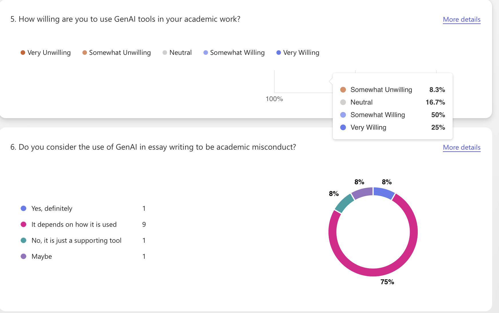
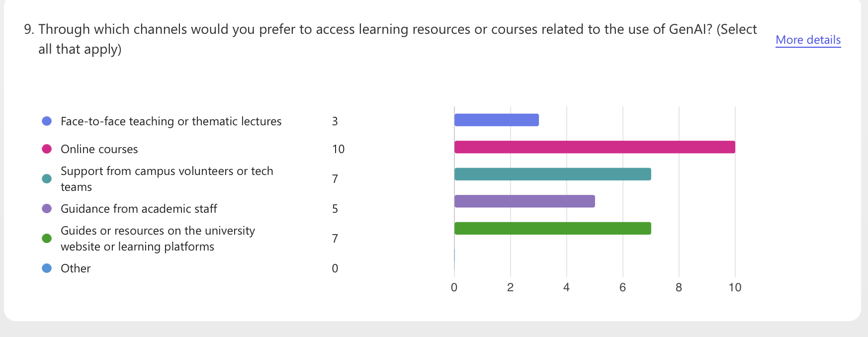
The advantage of using the software's automatic visualization generation function is its speed and low barrier to entry, but it also presents challenges: First, the interpretability of the visualizations is limited. The default templates in automatically generated data visualizations are simple, only showing the percentage for each question, making it impossible to perform cross-analysis or emphasize context. If the explanatory text doesn't include information on "sample size, missing data, and screening rules, "readers may easily mistake the percentages for "facts." Second, there are practical limitations in data collection. Only 13 responses were collected, and the questions were not detailed enough. Therefore, the small sample size and imbalanced questions resulted in visually stable but actually biased visualizations.
Overall, this exercise taught me that instead of pursuing "more elaborate charts," it's better to start with the questions and categories, and include the actions we want readers to understand and take in the annotations next to the charts.